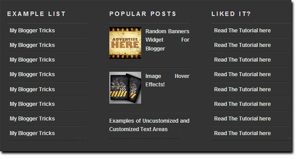
We had previously shared a tutorial on Three Column Footer Widget
which was well appreciated and today we have yet another more advanced
version of the same widget. This new widget can become three column,
four column or with as many columns as you wish. Further this new footer
widget has some great CSS effects added to it which makes it even
better. First see a demo to know what’s so different about it.
See the widget at the bottom of the following Demo blog,How To Add the Multi Column Footer Widget To Blogger?
First we will add the CSS code to your blogger templates and then the HTML. So without wasting any time lets jump straight to the steps,- Go To Blogger > Design > Edit HTML
- Backup Your Template
- Search for ]]></b:skin>
- Just above ]]></b:skin> paste the code below,
/*----- MBT MULTI COLUMN FOOTER WIDGET -----*/5. Now search for </body> and paste the following code just above </body>
#lower {
margin:auto;
padding: 0px 0px 10px 0px;
width: 100%;
background:#333333;
}
#lower-wrapper {
background:#333333;
margin:auto;
padding: 20px 0px 20px 0px;
width: 960px;
border:0;
}
#lowerbar-wrapper {
background:#333333;
float: left;
margin: 0px 5px auto;
padding-bottom: 20px;
width: 23%;
text-align: justify;
color:#ddd;
font: bold 12px Arial, Tahoma, Verdana;
line-height: 1.6em;
word-wrap: break-word;
overflow: hidden;
}
.lowerbar {margin: 0; padding: 0;}
.lowerbar .widget {margin: 0; padding: 10px 20px 0px 20px;}
.lowerbar h2 {
margin: 0px 0px 10px 0px;
padding: 3px 0px 3px 0px;
text-align: left;
border:0;
color:#ddd;
text-transform:uppercase;
font: bold 14px Arial, Tahoma, Verdana;
}
.lowerbar ul {
color:#fff;
margin: 0 auto;
padding: 0;
list-style-type: none;
}
.lowerbar li {
display:block;
color:#fff;
line-height: 1.6em;
margin-left: 0 !important;
padding: 6px;
border-bottom: 1px solid #222;
border-top: 1px solid #444;
list-style-type: none;
}
.lowerbar li a {
text-decoration:none; color: #DBDBDB;
}
.lowerbar li a:hover {
text-decoration:underline;
}
.lowerbar li:hover {
display:block;
background: #222;
}
6. Save your template and you are done!
<div id='lower'>
<div id='lower-wrapper'>
<div id='lowerbar-wrapper'>
<b:section class='lowerbar' id='lowerbar1' preferred='yes'>
</b:section>
</div>
<div id='lowerbar-wrapper'>
<b:section class='lowerbar' id='lowerbar2' preferred='yes'>
</b:section>
</div>
<div id='lowerbar-wrapper'>
<b:section class='lowerbar' id='lowerbar3' preferred='yes'>
</b:section>
</div>
<div id='lowerbar-wrapper'>
<b:section class='lowerbar' id='lowerbar4' preferred='yes'>
</b:section>
</div>
<div style='clear: both;'/>
</div> </div>
Now go to Page Elements and add your widgets to the newly added Footer Widget that will look something like this,

You
can observe that there a total of four columns by default and you can
add as many widgets as you want to each column. If you wish to increase
or decrease the number of vertical columns then follow the steps below.
How to Customize the Widget?
Well
I will keep it simple. I think the colors and overall size and padding
and margining are just perfect. The only thing that you will need to
adjust according to your template is the width of the widget and the
number of vertical columns.
1. In order to reduce or increase the overall width of the widget simply change width: 960px; 2. If you wish to decrease the number of widgets to three then simply delete this part of the code,
<div id='lowerbar-wrapper'>3. Or if you wish to add an extra column then add the code below just above <div style='clear: both;'/>
<b:section class='lowerbar' id='lowerbar4' preferred='yes'>
</b:section>
</div>
<div id='lowerbar-wrapper'>
<b:section class='lowerbar' id='lowerbar#' preferred='yes'>
</b:section>
</div>
Remember that lowerbar# refers to the column number. So if you want to add a fifth column then simply replace lowerbar# with lowerbar5.
After you have added the fifth column then remember to change width: 23%; with width: 17%;
You will repeat step 3 for as many columns as you wish to create. But three and four and five columns are a standard. Increasing them will make things look ugly.
That’s it! Enjoy :D

No comments:
Post a Comment